-Document Readability and Human Factors- In the event that you are one of the eighteen people worldwide who missed it as anything from a live event to a meme, Steve Harvey, the host of the 2015 Miss Universe competition, named Miss Columbia as Miss Universe when it was Miss Philippines who had won. Harvey had to interrupt the celebrating and announce the error.
To call the moment cringey is an understatement; if you’re at all susceptible to Fremdshamen, which is the German term for vicarious embarrassment, you’ll find the footage unwatchable. In what Harvey later told Jimmy Fallon was “four minutes of pure hell”, the crown was removed from Miss Columbia and placed on Miss Philippines as a visibly upset Harvey uttered apologies.
I sometimes think of Steve Harvey to console myself when I misspeak. Sure I feel stupid, but was I live on international television before an audience of over two billion people? Will I be a meme before I get to my car? I’m usually doing okay on the Steve Harvey scale for humiliation.
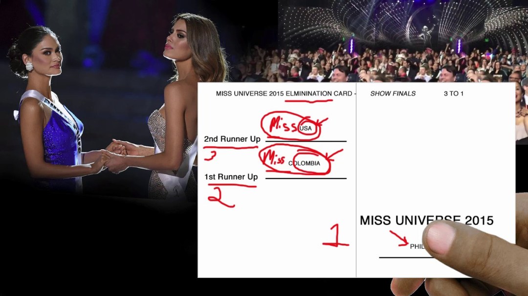
Do you wonder how a mistake like that happens in a production with a budget of roughly $100 million USD? The easy answer is, Steve Harvey read the card wrong. The more accurate explanation is that a document design problem led to human error.
As our friends at VOX discuss in their video (WATCH HERE), the typography of the elimination card was highly misleading. At a Miss Universe Competition crowning, second runner up is first announced, followed by Miss Universe; the first runner up announcement is defaulted by the winner announcement. Steve Harvey’s card displayed information that did not appear in the order it was to be read, included information that was not to be read at all, and placed the name of the winning country where a right-handed person’s thumb would be. A simple change to the typography would have made it a different night for Steve Harvey.
The Miss Universe winner card had only one purpose: to inform the host’s reading of the pageant winners. The casual choice of size, order, wording, and font (elements of typography) all jeopardized that purpose. From a human factors perspective, the error is understandable. From a system and document design perspective, it’s baffling.
Steve Harvey wasn’t the inventor of awards debacles. At Australia’s top model competition in 2010, host Sarah Murdoch, after also naming the runner up as winner, interrupted the acceptance speech with “I don’t know what to say right now. I’m feeling a bit sick about this. I’m so sorry about this. Oh my God. I don’t know what to say. I’m so sorry”.
Sarah Murdoch’s error wasn’t caused by a faulty document, but foreshadowed the human and fiscal cost of such an error. If you thought that separate envelopes could have mitigated the Miss Universe 2015 fiasco, fast forward to the 2017 Academy Awards when both the system and the document failed presenter Warren Beatty who was handed the wrong envelope. Beatty found the card confusing, but could not clearly determine from the card that it was an error. PricewaterhouseCoopers, risk assurance specialists, became the “you only had one job” icon on this one for providing the wrong card, and for the bush-league card and envelope design that combined with human factors to result in another embarrassing blunder.
Awards host Jimmy Kimmel did what he could to keep it light, saying “Guys, this is very unfortunate what happened. Personally, I blame Steve Harvey for this.”
Despite the unhappy hosts and contestants, and all the collateral damage of these very public errors, the magnitude of the risk connected to these errors was not physical harm, and that’s where feeling fortunate compared to Steve Harvey ends. In non-entertainment industries, much more serious outcomes are typically associated with failure, and although your budget may be significantly less than the $100 million budget of Miss Universe, your industry risk is likely much higher.
We insure our critical operations with documents. We create policies, work instructions, labels, reminders, and checklists all for the purpose of bolstering essential procedures and enhancing safety. This makes our documents far more significant than the Miss Universe winner card.
Do we take that seriously? Aviation has, in recent years, by studying and grooming their essential checklists to determine how the list is interpreted and used by humans. The role of checklists in actual incidents has been studied, and the design of the lists has been improved based on that authentic data, along with consideration as to what is known about human factors and the “cognitive limitations experienced by humans when dealing with stress, concurrent task demands, and time pressure”.
In Aviation
Based on their research and event analysis, here are some of aviation’s document considerations:
Typography: Typography is the “technique of arranging type to make written language legible, readable, and appealing when displayed”. It encompasses the font, presence or absence of serifs, size, spacing, layout and alignment of document text. Typography has an impact not only on readability, but on the size and weight of a printed document, which is a consideration, and on the amount of information that will display in a single screen view electronically.
Reference: Flightsafety.org typography
Phraseology: In aviation checklists, vocabulary is restricted, plain language is used to ensure clarity, and phonetically balanced words are selected to enhance readability. There is no unnecessary ambiguity or presumptiveness, such as “check switch”, when a specific value can be named, such as what the switch setting should be.
Structure: The final item in each checklist is to complete the checklist; the user of the list will have completed this task upon reading that item, and is signaled to release the list and move past it into other functions.
Order and Grouping: Related tasks are grouped together as much as possible, in order to capitalize on what we know about human short-term memory. Where possible, the layout and flow in the checklist relates to the cockpit geography.
Critical tasks appear first, as studies demonstrate that the initial items on a checklist are completed more reliably than later items, regardless of how critical the tasks are deemed to be.
What About Your Industry?
Sloppy and aimless documents deliver undesirable outcomes. If it’s important enough to document, the document needs to be designed with human factors, human fallibility, and the user’s environment in mind. The designer must ask the question:
What is the purpose of this document, and what is the worst thing that could happen if the document does not fulfill that purpose?
If the worst thing that could happen is that a crown will be grabbed off the head of a crying contestant and placed onto another, I’d still say you should try to get it right, and I’d have Steve Harvey and Warren Beatty on my side. However, if your worst thing is a risk to human wellness or life, is it really appropriate to design your document on a tablet during a budget presentation, and then turn it over to “the guy with the office near the copier who knows how to make a fillable document” for completion?
Your policy document is an important safety document. Its purpose is to clearly and memorably communicate important operational and safety information to a disinterested audience. It will be given an inadequate amount of time in which to impart that information, and will be referenced for information, except in an aftermath, only if to do so is easy.
How does what we know about documents like winner cards and aviation checklists apply to the design of policy documents?
Length
A crucial policy challenge is brevity- including the most important information in a readable manner using the fewest words. How do we do that? Cut. Cut. Cut. If you want your policy to be read, instead of to merely exist as your legal safety net, then it needs to be as tight as possible.
- Remove all cited regulations; reference them only
- Remove repeated material; refer to other policies only
- Remove metadata that is not relevant to users
- Differentiate policy material from reference material
- Hyperlink definitions
- Remove narrative that is not intended for users
Sequence
Like an aviation checklist, your policy should read in order of importance with the most essential information first. In a Just and Safety culture, your most important information is your policy’s concise purpose statement that transparently states the associated risk. Thereafter go your policy statement, scope, and procedures. Everything you add that you don’t see in this list increases the likelihood of failure.
- Purpose (Why)
- Policy Statement (What)
- Scope (Who)
- Procedures (How/When/Where)
- Help (references) (What else)
In the overall document, all policy that applies to a group of employees is divided into sections that are intuitive within the business. Typically there are overarching administrative policies, then various operational arms. The sections should make sense to your staff and align with your management structure and command silos.
Within your sections, order policies in rough accordance with your operational work sequence. Recognize that even in unpredictable work environments there is an intrinsic workflow. The Subject Matter Experts (SME) of workflow are your employees; consult them. Understanding the workflow is also part of creating procedures, and is a basic and important element of policy design.
Typography
A great deal is known about document readability, and there is really no reason to ignore that data when issuing what is arguably your foundational corporate document. Some common flaws are cluttered and mis-sized headers, numeral and text mixing, lack of white space, poor use of passive space, and lack or overuse of text division. Be familiar with accessibility regulations and best practice, and ensure that your document fulfills accessibility expectations.
Phraseology
Important considerations in policy phraseology are:
- Active voice
- Short sentences
- Plain language when possible
- Industry language (when used) compliant with a style guide
- Unambiguous wording (e.g. will vs. may)
- Unpretentious and accessible word choices
When documents fail personnel, employers often get to walk away from responsibility for the outcome because, after all, they’ve made it the employee’s responsibility to know and comply with policy. In Just and Safety Cultures we are abandoning that cavalier disregard for our design responsibilities. If you don’t know where to start, begin with your policies.
Visit our Reference page to download a sample of a readable policy layout.
photocredit: Learn UI Now
